Making an accessible web modal

While a lot of customers tell us they use Instacart to add valuable time back into their day, a community of users with mobility issues or visual impairments tell us they rely on our app as a dependable way to get the groceries they need. The Customer Engineering Team at Instacart is tasked with building a seamless in-app experience for every customer — so we take in-app accessibility for these customers really seriously.
One of the largest accessibility challenges we face is building an elegant (and usable) web modal. For standard situations, we use React-Modal which provides accessibility support right out of the box. Problem solved. Unfortunately, it’s not that simple. Some design and functional situations call for custom modals. This custom work requires that we tackle accessibility issues head-on. Following these best-practices helps us ensure that our modals provide the high-level of accessibility customers need and deserve:
- Ensure there is a close button available early in the modal DOM
- Maintain a focus trap and close when ESC is pressed
- Return focus to original element on close
- Apply correct roles and labels
- Include appropriate headings
- Test using a screen reader
Ensure that a close button is available early in the modal DOM
Leaving a standard modal can be very difficult and frustrating for keyboard users when there is no obvious exit mechanism. The modal should provide a close button for exiting easily. The button should be early in the content so the user does not need to tab through numerous elements to exit.
To optimize the keyboard user experience, it is preferable to focus on the close button when opening the modal.
In some cases, adding a close button within the modal or at the beginning of the content conflicts with ideal product design. One useful alternative is to create a hidden button that appears on focus.
The button appears when tabbed into
The button is not shown when focus leaves
We build an invisible button by setting the position off-screen and moving it back on-screen when it receives the focus. This provides keyboard users with a simple way to exit when they reach the element. The core design objectives are preserved while we simultaneously provide an excellent accessibility experience!
| CloseButton.propTypes = { | |
| hideRetailerChooser: PropTypes.func.isRequired, | |
| } | |
| function CloseButton({ hideRetailerChooser }) { | |
| return ( | |
| <button aria-label="close store chooser" onClick={hideRetailerChooser} style={styles.button}> | |
| <SVGIcon name="x" /> | |
| </button> | |
| ) | |
| } | |
| const buttonStyles = { | |
| top: -9999, | |
| left: -9999, | |
| border: 0, | |
| background: 'none', | |
| position: 'absolute', |
Maintain a focus trap and close when “ESC” is pressed
The focus trap is another key accessibility feature for modals. The trap ensures that focus cannot leave the modal until it is explicitly closed. Tabbing with the modal open will cycle through all interactive elements in the modal and finally back to the first element once the end is reached.
In the words of Admiral Ackbar “it’s a trap”, which ensures the user stays within the relevant content.
To achieve this, focus must be explicitly moved back to the first element in the modal if the user tabs past the last element. Similarly, focus must move to the last element when back-tabbing past the first element. In React this can be achieved by handling the onKeyDown event.
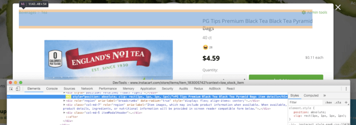
Screen reader only headings can be achieved by using the following styles.
{ position: 'absolute', clip: 'rect(1px, 1px, 1px, 1px)', overflow: 'hidden !important', }
The magic is clipping the header position and hiding the overflow. This renders the element invisible in standard application views but available to screen-readers. Win-win.
Test using a screen reader
To ensure the best experience for assisted technology users; empathy is a must. There are few better ways to understand the struggles of users than stepping into their shoes — whether it’s for a block, a mile, or sometimes a marathon.The final step in accessibility development is thoroughly testing the full experience using a screen reader (VoiceOver, NVDA, JAWS, etc…). You will certainly appreciate the easy close button, the sane modal trap, and clear heading information you built into your app. We did with ours. Maybe you’ll even notice other accessibility challenges beyond these best-practices and add new cutting-edge solutions. Best of all — you will have optimized the experience for a critical segment of your users and hit another milestone in providing a seamless in-app experience for every customer 😄.
Want to build an even more accessible app with me and Instacart’s Customer Engineering team? Instacart is hiring! Check out our current engineering openings.
Thanks to Dan Loman.

Logan Murdock
Author
Logan Murdock is a member of the Instacart team. To read more of Logan Murdock's posts, you can browse the company blog or search by keyword using the search bar at the top of the page.
